Music Store
Amoeba


Client information
1 / Introduction
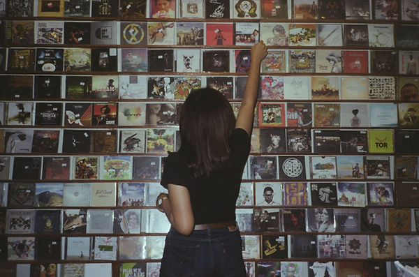
Amoeba Music is a world-renowned independent music store and a cultural institution. Since opening its doors in Berkeley in 1990, it has expanded to iconic locations in San Francisco and Hollywood, becoming the largest independent record store in the world.
Known for its "old school vibe" Amoeba serves as sanctuary for Cinephiles, Record collectors, musicians, fans and toursits.
2 / Challenge: Digital Gap
While the physical stores are masters of "the hunt"– that feeling of discovery in the bins–the digital presence hasn't fully capture that magic. The site struggles to balance the needs of two different audiences.


Goals
01
Dual-User Optimization
The purpose was to create a seamless path for First-time Visitors (logistics and ease of use) and Loyal Collectors (deep exploration and e-commerce).
03
Simplify Navigation
The third import purpose was to replace complex web jargon with intuitive Information Architecture that speaks the language of music and movie lovers.
02
Bringing the Physical-Digital Gap
The second purpose was to make the online experience feel rich and discovery-oriented as browsing the bins in Hollywood or Berkeley.

Why?
It’s not just about "modernizing" the site. It’s to capture lost revenue and ensure Amoeba remains the go-to authority in the changing media landscape.
Adapting and protecting the brand legacy highlighting the high-value inventory to the collectors who are looking for them. Also for the loyal costumers improving exploratory seeking (how they discover new music), keeping them engaged with the brand online just as much as they are in person
Reducing the "Bounce" Rates to maintain new users at the site and they can quickly find the basic information like store hours or event dates.
For future-proofing with a cleaner, more organized IA allowing to scale the digital offerings.
Used Tools
Figma
Used to create the ideas digital sketches about the website information architecture structure.
Gmail
To send the tree testing link and the zoom links to the participants.
Zoom
Used to have virtual meetings with the participants at the card sorting phase.
Proven By Users
Used for create the card sorting and tree testing to test data with the participants to improve the website.
Miro Board
To obtain feedback and critique from other designers
Google Slides
We create different presentation slides to show the progress during all these phases.
Google Sheets
I created the card sorting questions and to normalize data from the website.
Canva
To create the original and the new box and arrow diagrams.
Google Docs
To create the original and the tree testing spreadsheet sitemap.
Content Audit
The goal was to qualitatively evaluate and organize the existing website data to ensure it is accurate, functional, and "usable" for the target audience.
Application is no longer available.
Categorization
Using this help to have a better understanding of the current labeling system, and develop a systematic taxonomy to run online and offline card sorting sessions.

Card Sorting Team
1.Citlalli
2. Javi
Our job wast ro create the cards and then analyze the information obtained.
Card Sorting
Creation
My teammate and I analyzed the information on the page and decided to make the cards presented on the other side, which are based on different points and sections of the Amoeba page.
Application is no longer available.

Application is no longer available.
Card Sorting Analysis
The analysis reveals a split mental model: while "Expert" users look for technical specificity (Vinyls, Exclusives), "Casual" users prioritize broad content types. Given the 18–36 age demographic, the architecture must lean toward speed and digital familiarity.
Participants
6 participants around the ages of 18 to 36.
Total cards = 40.
All participants completed the card sorting activity.
Category Popularity
"Merch" and "Website Info" were the most popular.
Least Used "Announcements", "Cleaning tools", "Products", and "Recomendations".
Category Appearance
"Amoeba Music: Who We Are", "Having Technical Issues on Amoeba.com? Contact us!",
"Blade Runner [1982 - Final Cut] (DVD)" and "Liar Liar (1997 25th Anniversary) Blu-Ray" were strongly associated with the correct category.
Co-appearance data
The cards mentioned before were successfully grouped.
"Vinyl Groove Washer Cleaning Pad" often ended up in its own niche category and did not consistently group with other items.
Results
Application is no longer available.
New Categorization


Sitemap
In this section was the creation of the sitemaps to have organization between the hierarchy of the pages through categories and labels. This will guide the audience to the right path through the site based on the previous information.
The ones I created were: Box-and-arrow diagrams and outlines.
Application is no longer available.
Application is no longer available.

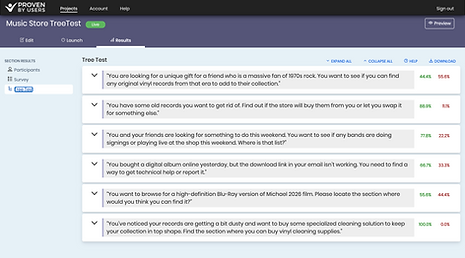
Tree Testing
Tree Testing
After the card sorting was the time for tree testing so I created the tree testing at Proven By Users site and then I got the 9 results from the participants. This was important to make sure that the site structure was the adequate for the site and then I made the needed modifications.
Application is no longer available.
This is the final sitemap for the Amoeba Music Website based on the information provided by the participants at the cart sorting and the tree test.
Application is no longer available.
Navigation & Wayfinding
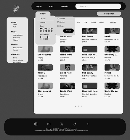
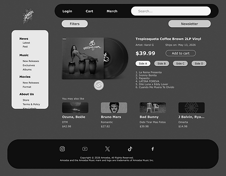
After obtaining the final sitemap diagram, it was time to create the digital version and determine how the information on the site would appear (template or visual structure).
Navigation & wayfinding helps users find information and take the desired actions.


Navigation & Wayfinding (2)
Based on the prior information and feedback, it was time to improve the design.
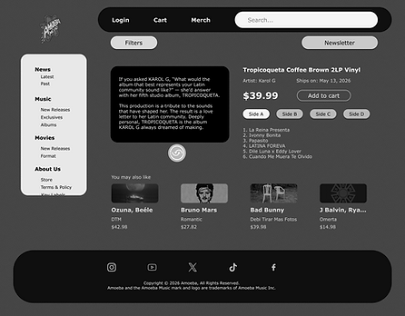
So these were the modifications: I added the filtering and faceting, the color palette, and the accent color (Amoeba yellow).


.png)
.png)


Final Project
After analysing the data from the card sort, the information obtained from the tree test, the sitemaps, the previous digital wireframes, and the feedback obtained from other professionals. Was the time to make sure that everything was working the best. So, that is when I added the final touches: the addition of 2 more sorting methods to organize the information. Also, I removed the hamburger menu and only used the secondary navigation for the best purposes or user-accessibility.
Click here for Step 3 Figma File


Strategic Structure
By replacing the complex web structure with a more focused taxonomy, the site transforms into a musical treasure hunt. This directly addresses the "digital divide," ensuring that first-time visitors immediately locate the store's logistical information (thereby reducing abandonment), while simultaneously channeling loyal collectors toward high-margin inventory—such as "Amoeba Exclusives" and "Limited Edition Vinyl."
Based on the results of navigation structure tests (*Tree Testing*)—in which Task 2 (Buy/Sell/Trade) and Task 3 (Events) recorded high success rates following the restructuring—the new Information Architecture (IA) has been designed to achieve a 35% increase in the findability of "Buy/Sell/Trade" services: a critical revenue stream that fuels Amoeba's unique ecosystem of second-hand inventory.
User impact
"I used to feel like I was looking at a spreadsheet; now I feel like I'm browsing the bins in Hollywood. It finally feels like Amoeba."
— User Testing Participant (Age 24, Record Collector)


Next Phase
The immediate next step is evident:
Implement "Hybrid Filtering": Building upon the Navigation and Orientation phase, the most practical measure is to deploy the new filtering and faceting system. This allows users to sort results simultaneously by "Format" (Vinyl, CD, Digital) and "Condition" (New vs. Used). By eliminating the hamburger menu in favor of persistent secondary navigation, a "frictionless journey" is offered that emulates the ease of browsing from the Jazz section to the Rock section in a physical store.
Lesson
Throughout this project, I learned that the key is to create a solid and versatile structure that functions effectively for the user. By employing techniques such as card sorting and tree testing, I was able to achieve superior results regarding categories, filters, and subcategories, and to implement the necessary modifications to successfully increase user engagement on the site.
Furthermore, I learned that information normalization plays a crucial role, serving as the very foundation of the design; built upon this base, the project gains the strength it needs to stand out and establish itself as a reliable and fresh resource for both new and existing users.